Restructuring Strategy
OMF Canada had limited resources to improve their site’s user experience and marketing strategies over the years. With the organization’s rebranding, they saw an opportunity to better understand their users and reflect this understanding online
Here are some of my key initial steps:
- Aligning with leadership on tactics and approaches
- Gathering security requirements for the donation process
- Reviewing analytics for SEO and UX improvements
- Aligning information architecture with users' expectations
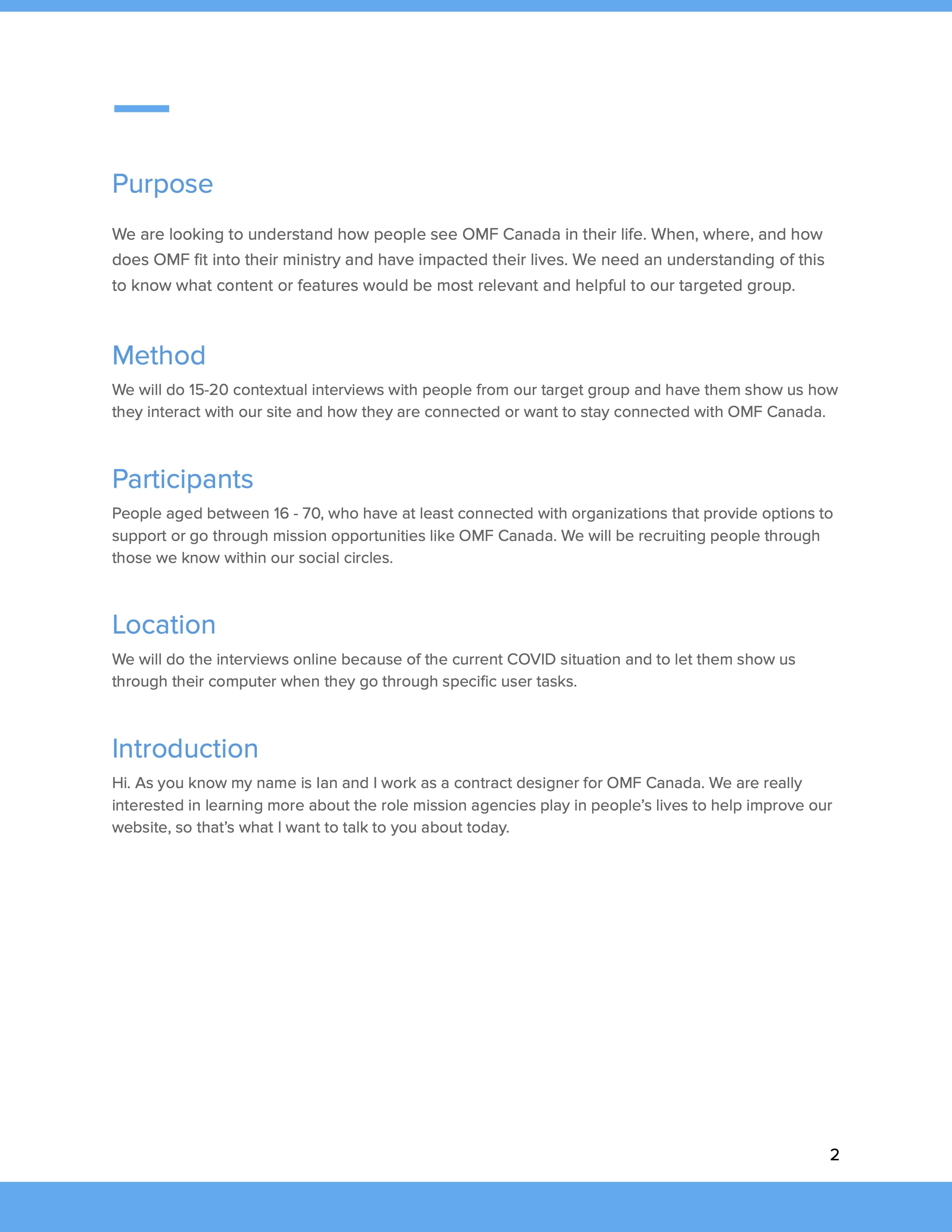
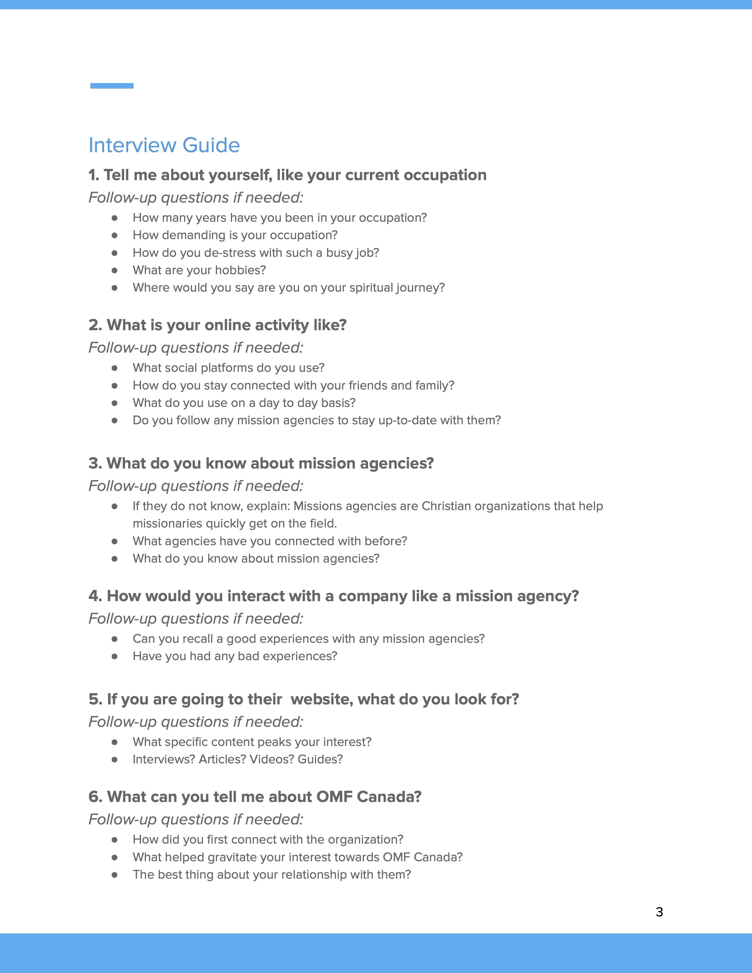
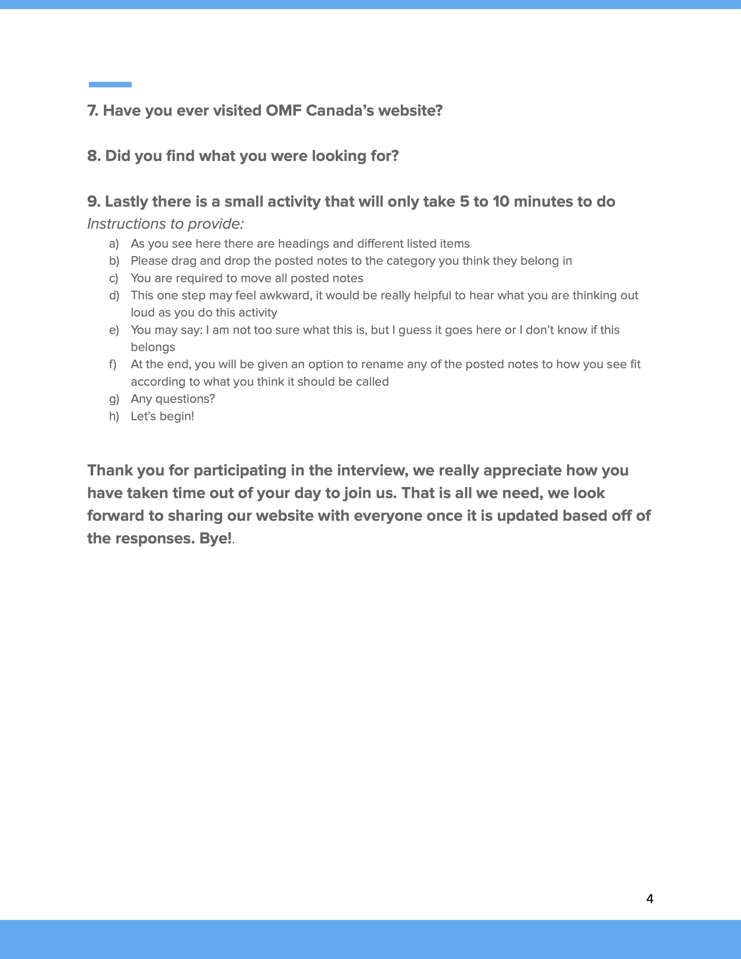
I developed a user research plan to gather necessary data and establish clear problem statements before diving into solutions. This plan included defining the purpose, method, participants, location, and interview script.
Stakeholder-Driven Design
There was heavy involvement from stakeholders in content creation, with little advocacy for the end-users. To create a seamless experience from marketing engagement to the site itself, OMF Canada needed a deeper understanding of their users. They needed clarity in the following things:
- What content mattered to users?
- How to reach out to their users?
- What did users look for on their website?
- What terms were used that users affiliated with most?
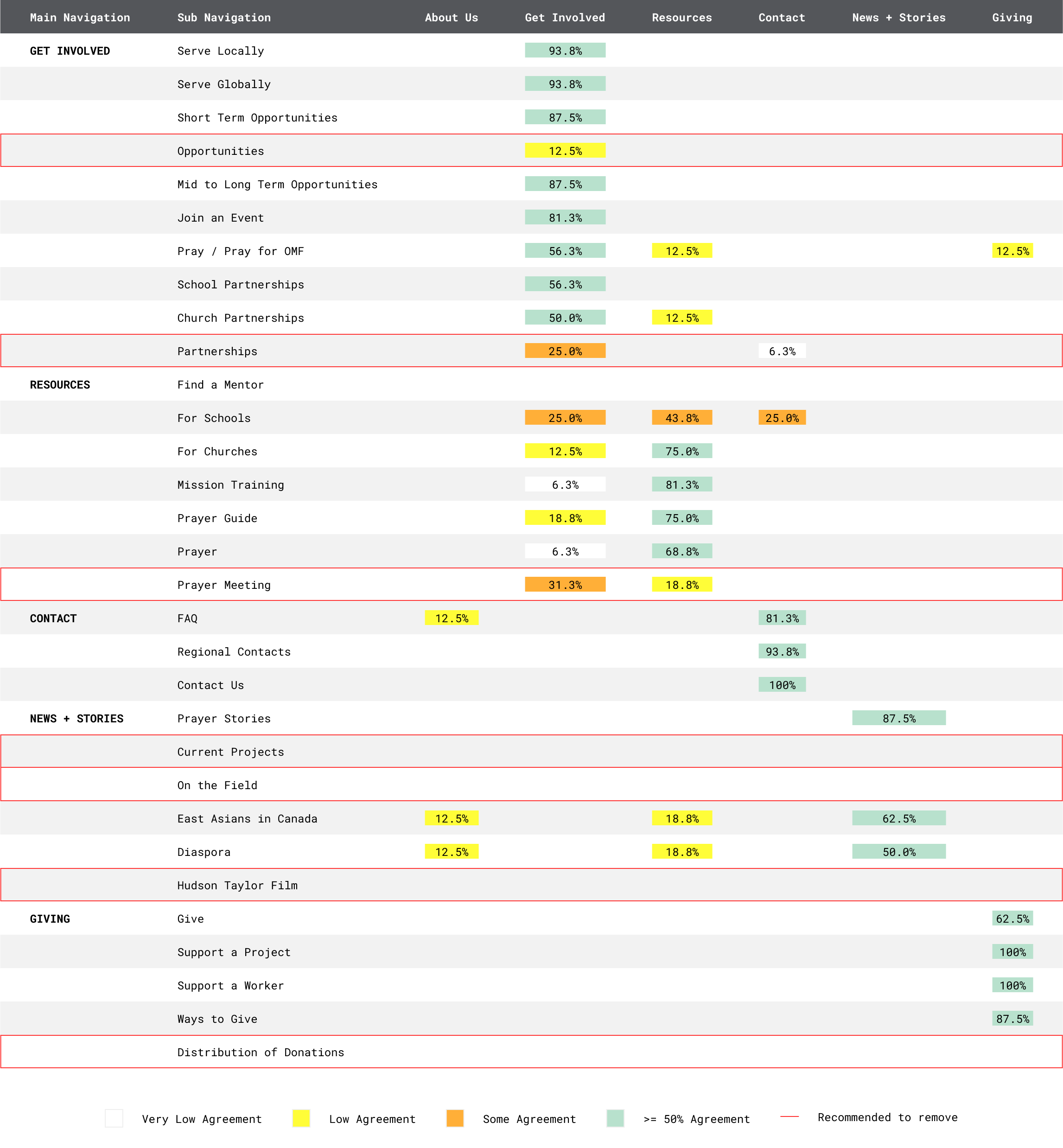
To make sure there was alignment in the beginning with all stakeholders, an internal and external card sorting exercise was done to represent the misalignment not only internally and how it differed from those outside the organization. Below is an example of the totality of the differences and what came out of it to have a clearer IA that matched business and users.
Meeting Users Expectations
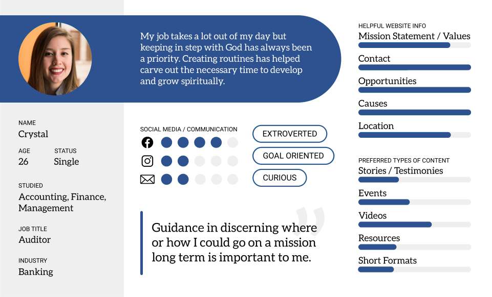
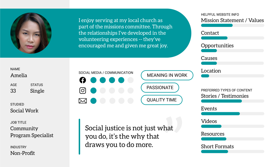
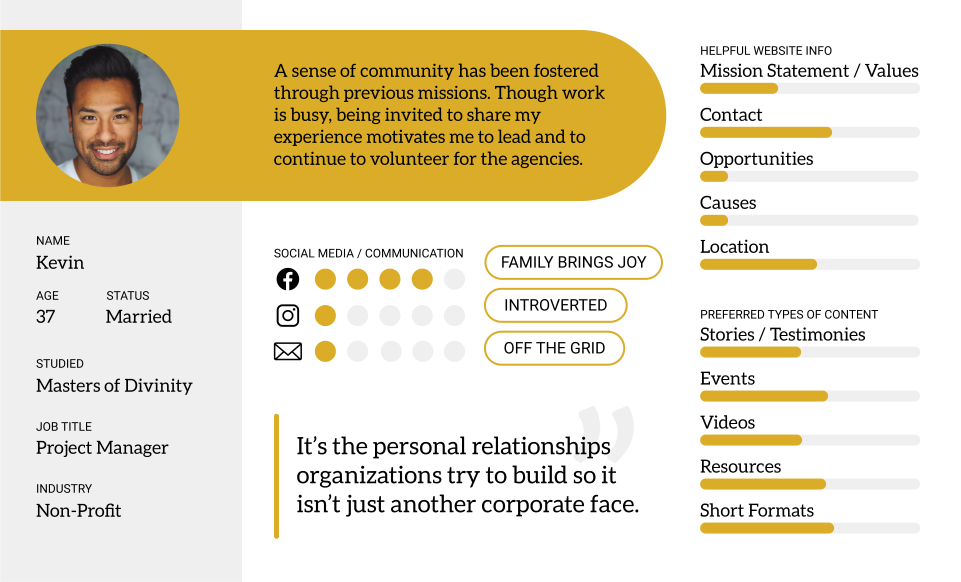
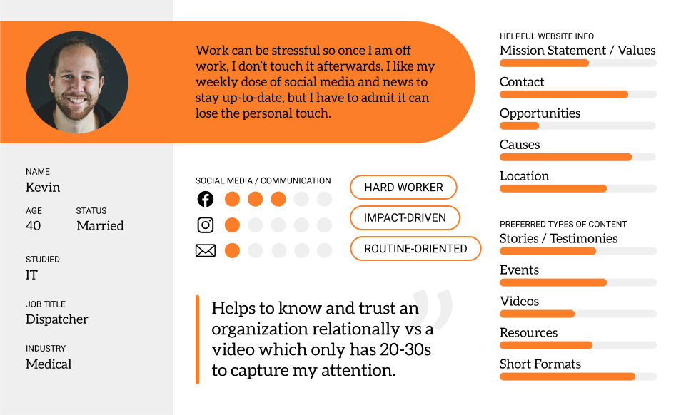
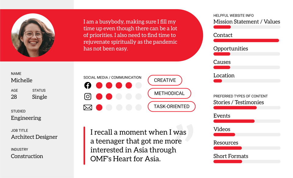
Creating user personas became crucial for aligning many things the stakeholders needed to bring in prospective donors and volunteers. I led the creation of a script for user interviews, which were conducted over 2-3 weeks. Post-interview, I analyzed the responses, translating qualitative data into quantitative insights. This helped us better measure user preferences, including:
- Website information preferences
- Preferred content types
- Social media and communication preferences
With the organized information split up by personas, it would help the stakeholders understand where the gaps are and to prioritize the best method to continue with outreach support for each type or donor or volunteer. At the same time, by understanding each persona more clearly we can have overlapping outreach materials that meet more than one group of users.
Streamlining Donations
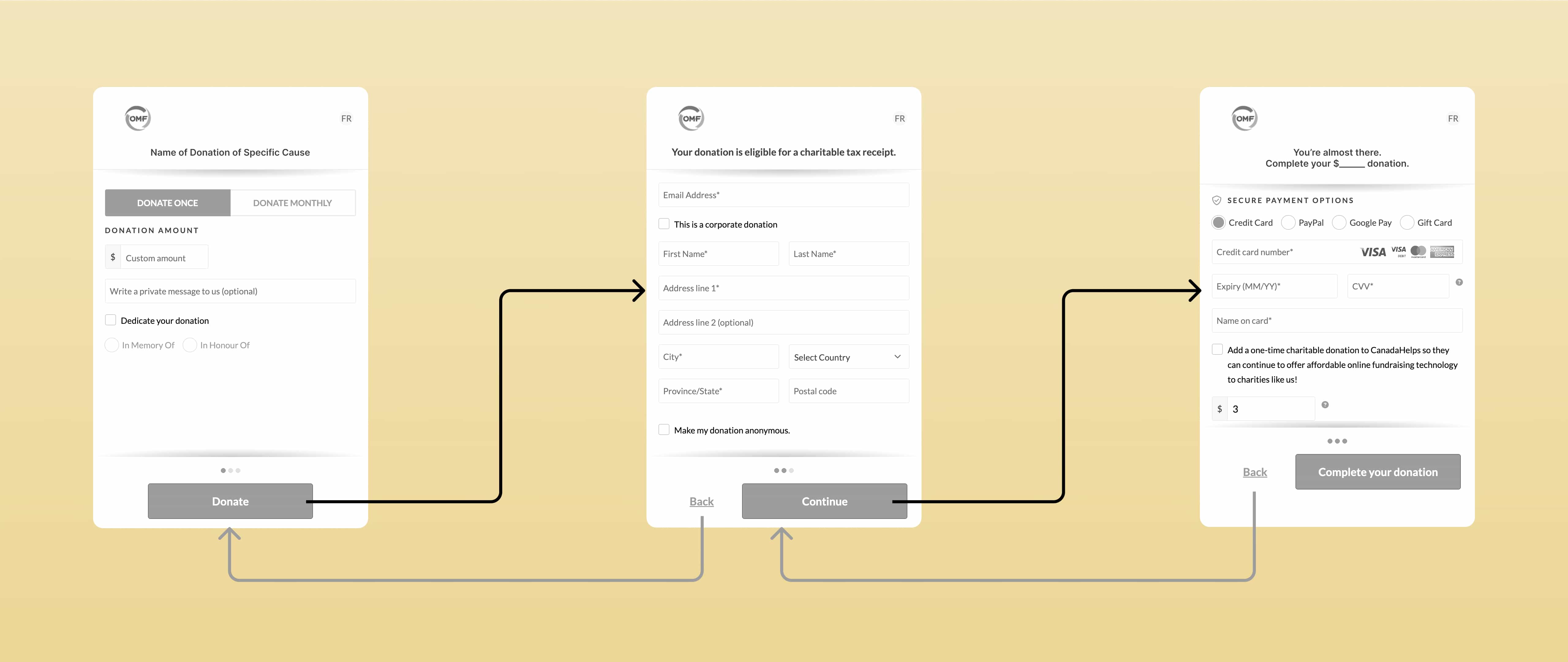
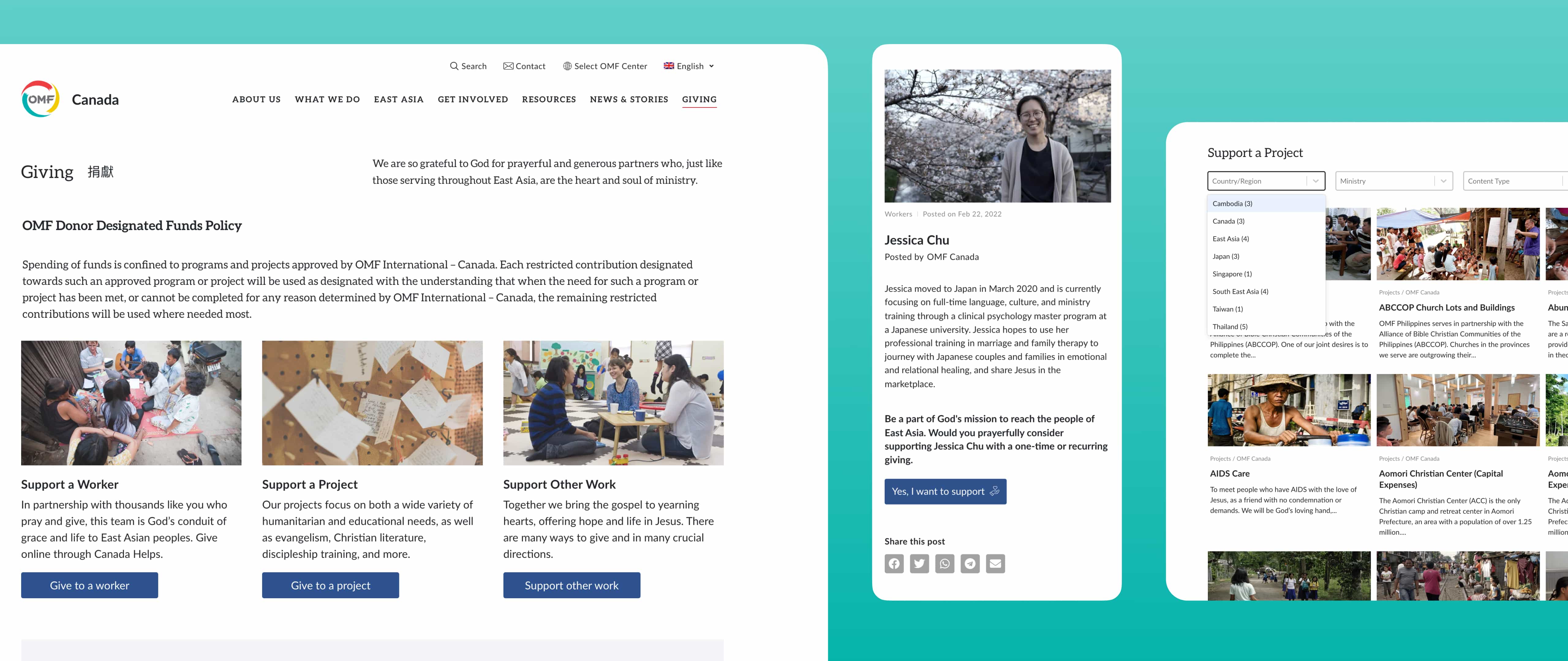
The donation section also needed significant improvements as it was a 1 link dedicated for donations. The options were previously presented in a long, cumbersome drop-down list, making it difficult to use and share. To streamline this, I grouped donation options into three categories to enhance usability and ensure security:
- Support a Worker
- Support a Project
- Support Other Work
