Initial Kick-off Meetings
A meeting took place with marketing and communication team members with the intention of improving the platform somehow. The managers responsible for dealing with administrative systems and internship programs was also there to provide an overview of the project.
As we weren't familiar with their product, we had to get clarity by posing the following questions to help us identify the needs of the user or function of the platform:
- Who would be using the platform?
- In what ways did the user(s) access and use the platform?
- How did you reach out to your users?
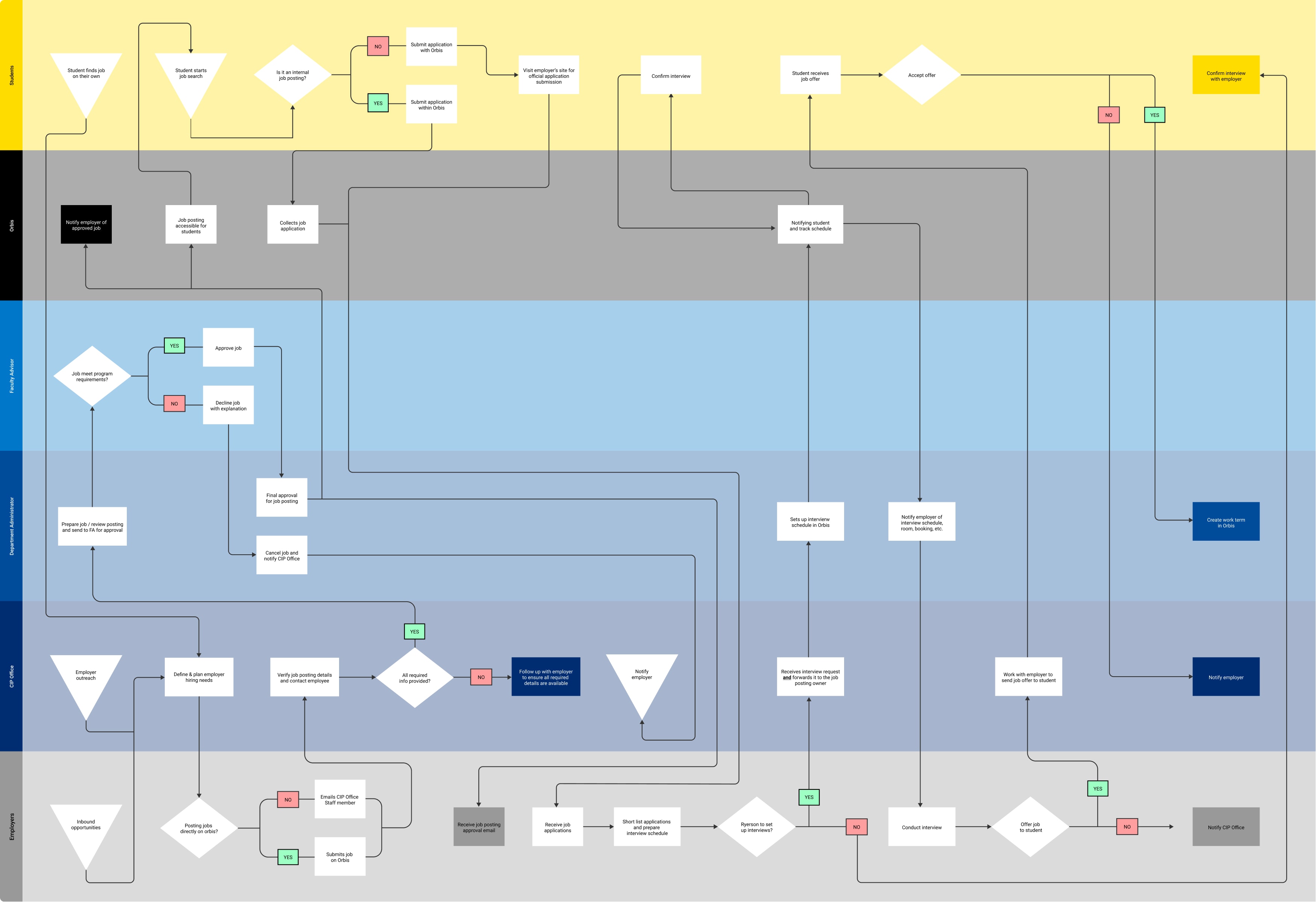
Despite the limited time given to complete the project, getting the answers helped the project to progress quicker. We now understood that the users would comprise of: Career Internship Program Office, Department Administrators, Faculty Advisors, employers, and students.
Our team decided to heuristically evaluate the platform to familiarize ourselves with the ins and outs of the current system. We followed various user journeys based off of a chronological mind map provided by the manager. I focused on mainly the external facing product that employers and students would come across.
Lack of Standards
As part of my role as a designer, I ensured that our digital and analog assets were up to brand standards including the AODA standards (Accessibility for Ontarians with Disabilities Act). After the heuristic evaluation, here were the problems that I discovered:
- Students have difficulty applying for job postings because of the lack of consistency in the job posting system
- Employers are potentially overwhelmed by the over-abundance of content on the various pages when looking to post job opportunities through Ryerson University's platforms
Setting the Pace
We reviewed other student networking platforms to gain an understanding of ways to improve the platform and find possible solutions. From browsing other sites, I realized that many of them were conceptually similar but with different skins. Instead of reinventing the wheel I looked for designs and functions that were necessary for a minimum viable product (MVP) first. Any extra features found were kept in my backlog as potential add-ons for the future. During this stage, I took note of details including the number of clicks to access certain pages, what made each page accessible when in mobile, and how the information was organized.
Framing the Solutions
The comparison of systems made me realize that our sites lacked consistency due to poor branding and visuals, which took away from the authenticity of the user experience. To tackle some of the above pain points noted previously by applying my findings from other applications, these were the potential solutions that I proposed:
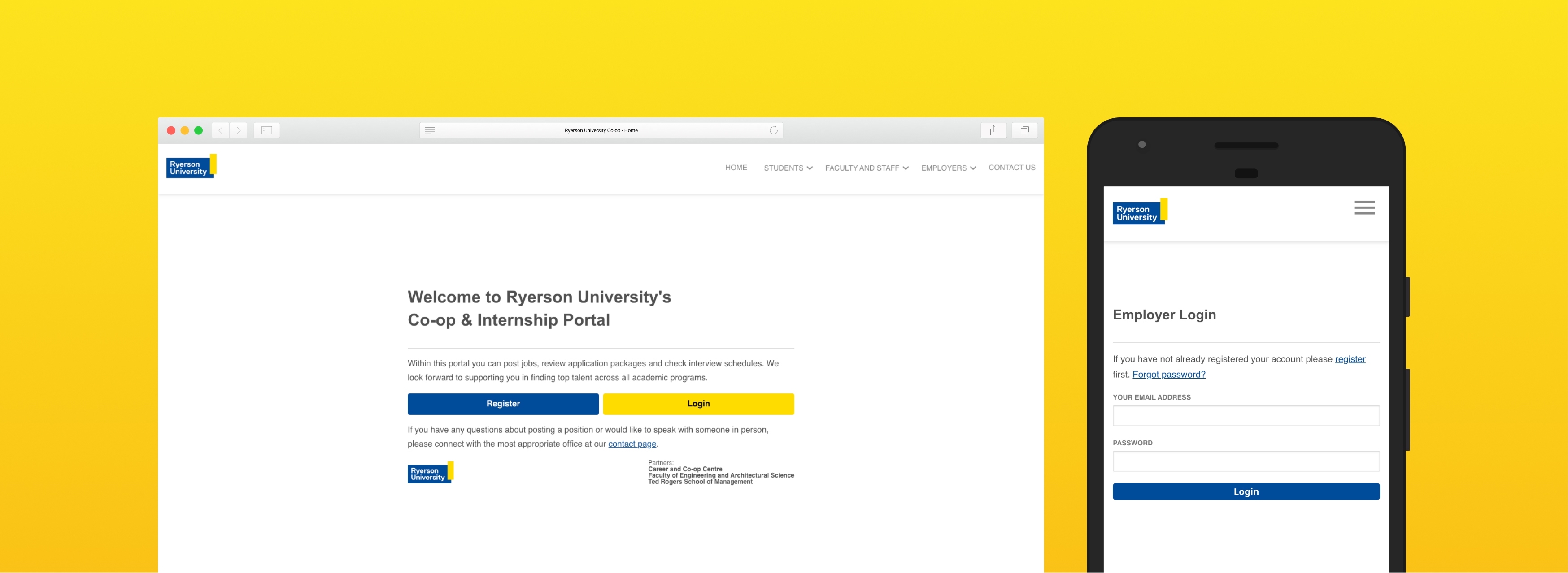
- Implement pages in alignment with AODA standards that primarily featured mobile-first designs so students and employers can view the page properly on all devices
- Provide digital platform components with Ryerson’s branding
- Establish user-specific based design that includes flatter hierarchy for the architecture of the directory so that it is easier to navigate through
Prototyping Flows
Knowing we were working with only WYSIWYG (what you see is what you get) editing blocks within certain pages of the platform, I had high assurance of simply utilizing JavaScript to follow the same look & feel of components of Ryerson’s main site.
With the soft launch (which may have been changed since March 2020), there has been much more consistency across different Ryerson platforms. There is more clarity between potential employers and even students who look to connect with the right contact through our new directory pages. The contacts are sorted for the type of users, along with unifying the departments under the entity of Ryerson University.


